White House UFC Design Mocked: Internet Roars Back
Baca dalam 60 detik
- The design, featuring octagon-inspired motifs and fighter silhouettes, was intended to project strength and resilience.
- Instead, it backfired spectacularly, drawing comparisons to a low-budget pay-per-view event.
- Social media users unleashed a torrent of memes, mocking everything from the color palette to the font choices.
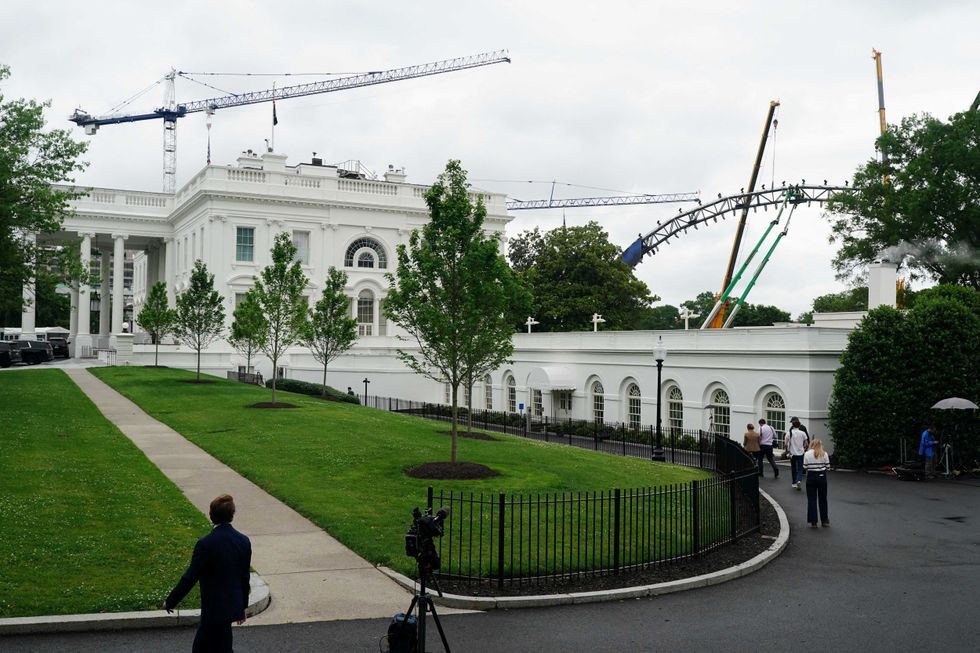
The design, featuring octagon-inspired motifs and fighter silhouettes, was intended to project strength and resilience. Instead, it backfired spectacularly, drawing comparisons to a low-budget pay-per-view event. Social media users unleashed a torrent of memes, mocking everything from the color palette to the font choices.
This isn't the first time the White House has fumbled a branding initiative. Previous attempts at modernizing official imagery have faced similar backlash, revealing a persistent gap between political messaging and public taste. The UFC design amplifies that disconnect, turning a strategic move into a liability.
For the administration, the optics couldn't be worse. The design aimed to energize a younger, male demographic but instead united critics across the political spectrum. The backlash signals that authenticity matters more than shock value in political branding.
Power Move: The White House just learned a costly lesson: cultural relevance can't be manufactured. Expect a swift, quiet retreat from this design and a renewed focus on safer, more traditional imagery. The real power move now is damage control.
This article was edited with AI assistance for readability. Read original here.